Hue Is an Angle: From Newton's Prism to the Color Wheel in Your Stylesheet
When you write hsl(217, 83%, 53%), that first number isn't a quantity — it's a direction on a wheel. Here's the 350-year journey from Newton's prism to the HSL color cylinder behind modern CSS.
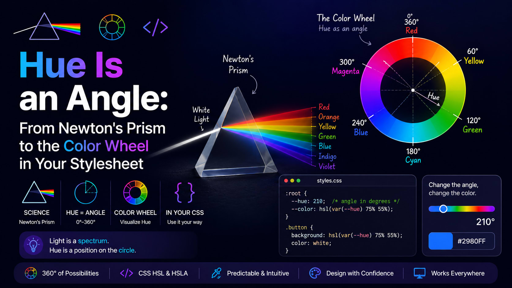
Pick any colour on a screen and ask where it lives, and the honest answer is: on a wheel. Not a list, not a grid — a circle. When you write hsl(217, 83%, 53%), that first number isn't a quantity of anything. It's a direction. Two hundred and seventeen degrees around a ring of colour, the same way a compass bearing points you across a map. That small idea — that hue is an angle — is older than computers, older than photography, older than the United States. It begins, like a surprising number of good ideas, with Isaac Newton and a dark room.
Newton bends the rainbow into a loop
In the 1660s, Newton shut himself in his rooms at Cambridge, made a small hole in the shutter, and let a single beam of sunlight fall through a glass prism. Out the other side spilled the spectrum — red, orange, yellow, green, blue, violet — fanned out in a strip. Everyone had seen rainbows; Newton's leap was to argue that white light was a mixture of all these colours, and the prism merely separated them.
But he did something stranger in his later book, Opticks (1704). He noticed that the two ends of the spectrum, red and violet, somehow looked like relatives — as if the colours wanted to meet. So he took that straight strip of spectrum and curled it into a circle, joining red to violet to close the loop. He even mapped the divisions to the notes of a musical scale, convinced colour and harmony shared a hidden grammar.
That curled-up spectrum was, in effect, the first colour wheel. And it bequeathed us something we still use three centuries later: the notion that colour is cyclic. There is no "last" colour. Travel far enough around and you arrive back where you started. Every time a hue value rolls over from 359° back to 0°, you are walking the exact circle Newton drew by candlelight.
From wheel to globe
A flat wheel, though, can only say so much. It tells you which colour, but not how pale or how deep. Throughout the 1800s, artists and scientists kept trying to give colour a fuller shape. The German painter Philipp Otto Runge built a colour sphere in 1810, stacking hues around the equator with white at the north pole and black at the south. The poet Goethe wrote a whole rival theory of colour. The chemist Michel Eugène Chevreul, managing the dye house at the Gobelins tapestry works, catalogued how colours influence their neighbours — work that would later ripple into Impressionist painting.
The throughline in all of it was a dawning realisation: describing a colour properly takes three numbers, not one. You need its hue, but also its lightness and its vividness. Colour isn't a line or even a wheel. It's a solid — a three-dimensional space you can move around inside.
Munsell makes colour teachable
The person who nailed this down was an American art teacher named Albert Henry Munsell. Frustrated that his students described colours with mushy words like "salmon" or "drab," he set out, in the early 1900s, to build a colour system as precise as a thermometer. His answer had three axes, and if they sound familiar, that's the whole point:
- Hue — the colour family, arranged in a circle.
- Value — how light or dark it is, from black to white.
- Chroma — how saturated or pure it is, from grey out to full intensity.
Munsell arranged real painted chips into a lumpy, irregular solid — irregular because, as he discovered, some hues can get far more vivid than others before they max out. (A pure yellow reaches blinding intensity; a pure blue-violet simply cannot get as colourful.) His system was so practical that it's still in active use today, from grading the colour of soil to matching the glaze on teeth. More importantly, Munsell handed the twentieth century a clean mental model: hue, lightness, saturation. Three dials.
It would take a few more decades, and an entirely new kind of machine, for those three dials to become something you could type.
The computer needed a friendlier colour
Fast-forward to the 1970s. Early computer graphics researchers had screens that spoke fluent RGB — red, green and blue voltages driving the display. The trouble was that RGB is wonderful for machines and miserable for humans. Quick: to make a slightly duller, darker orange, what do you do to the numbers 255, 165, 0? Most people have no idea. You end up nudging three values and squinting.
In 1978, a computer graphics pioneer named Alvy Ray Smith — who would go on to co-found Pixar — published a model designed to fix exactly this. He took Munsell's human-friendly idea and gave it tidy math that a computer could compute in real time. His version was HSV (hue, saturation, value), sometimes called the "hexcone" model because of its faceted shape. A very close cousin, HSL (hue, saturation, lightness), arrived in the same era and became a darling of the web. Both do the same job: they rotate the clumsy RGB cube into something a person can actually reason about.
This is the quiet history hiding inside your stylesheet. When you reach for HSL, you're using a 1970s computer-graphics reinvention of a 1900s art-teacher's system that was itself built on a 1700s insight from Newton. Few three-line CSS values carry that much lineage.
The shape of HSL
So what does the HSL solid actually look like? Picture a cylinder — though, as we'll see, "double cone" is closer to the truth.
- Hue is the angle as you walk around the outside: 0° red, around through 120° green, 240° blue, and back to red. That's why it's measured in degrees, and why rotating the hue by 180° lands you on the colour directly opposite — the complementary colour. The geometry is the colour theory. Converting a hex code into that angle, a saturation, and a lightness is precisely what a HEX to HSL converter does in the blink of an eye.
- Saturation is how far you stand from the central pole. On the axis itself, everything is grey; push outward and the colour grows vivid.
- Lightness is your height. The bottom of the solid is black, the top is white, and the pure, most colourful version of any hue sits exactly halfway up, at 50%.
Here's the elegant, slightly mind-bending part. Because every hue must collapse to a single point of pure black at the bottom and pure white at the top, the solid pinches at both ends — fat in the middle, narrow at the tips, like two ice-cream cones stuck base to base. That geometry explains a thing every designer eventually bumps into: you cannot have a colour that is both extremely light and extremely saturated. A near-white at 95% lightness has almost no room left for saturation, because at that height the cone has narrowed to a sliver. The maths and the visual experience agree, because one is just a description of the other.
It also explains why building a palette in HSL feels so natural. Want a hover state that's a touch darker? Drop the lightness a few points and leave everything else alone. Want a muted background version of your brand colour? Pull the saturation down. Want a colour scheme? Spin the hue to a few evenly spaced angles. You're not guessing at new hex digits; you're moving deliberately through a space that was designed for human intentions.
The catch nobody mentions
HSL is intuitive, but it carries a white lie. Its lightness axis is mathematical, not perceptual — it treats all hues as if equal numbers meant equal brightness, and our eyes flatly disagree. A pure yellow at 50% lightness looks luminous and almost glowing; a pure blue at the very same 50% looks deep and dim. Line up a rainbow of fully saturated hues all set to l: 50% and they'll march up and down in apparent brightness like a jagged skyline, even though the number says they're identical.
For a lot of everyday work this doesn't matter. But it's the reason colour science kept going after HSL. Models like CIELAB and, more recently, OKLCH — now arriving in modern CSS — rebuild the same hue-lightness-chroma idea on top of measurements of actual human vision, so that equal steps finally look equal. They are, in a sense, Munsell's irregular, honest, lumpy solid finally rendered in software. HSL was the friendly approximation that got us here, and it remains the easiest of the family to picture in your head.
A circle that never closed
There's something pleasing about the fact that the colour wheel never really got replaced — it just kept gaining dimensions. Newton's loop became Runge's sphere, became Munsell's solid, became Smith's hexcone, became the cylinder behind every HSL value on the web, and is now being gently reshaped again by OKLCH. Each generation kept the central image: hue goes around, lightness goes up, saturation goes out.
So the next time you set a colour with three little numbers and a couple of percent signs, it's worth remembering what that first number really is. Not a code. Not a quantity. A bearing on a wheel that a man drew in a dark room more than three hundred years ago, still spinning quietly inside your screen.
