How JPEG Quietly Throws Away Most of Your Photo (and Why You Never Notice)
Your phone photo was ten times bigger before it was saved — and most of that data was deliberately deleted. Here's the elegant mix of maths and psychology behind JPEG, what the quality slider really d
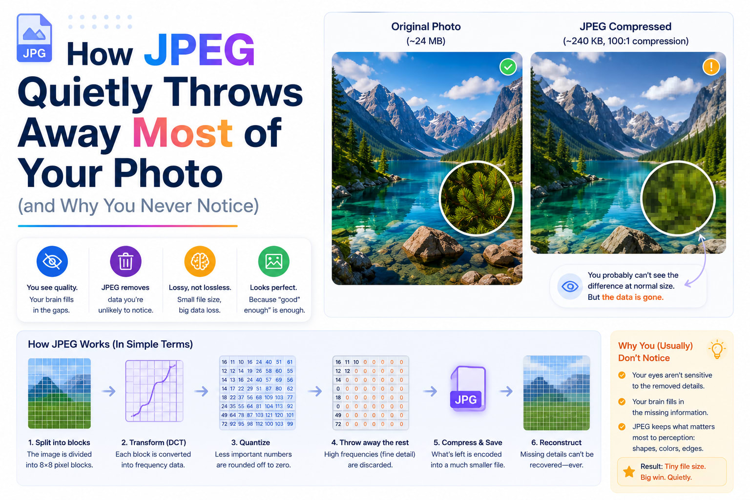
Take a photo on a modern phone and the result feels almost weightless — a few megabytes you fire off without a second thought. But that casual little file is hiding something remarkable. The picture your camera actually captured was roughly ten times larger than the file you ended up with, and somewhere between the shutter and the saved image, most of the data was deliberately, permanently thrown away. You never noticed, and that's the whole point.
The trick that pulls this off is JPEG, the compression format behind the overwhelming majority of photographs on the internet. It has been quietly discarding parts of your pictures since 1992, and understanding how it decides what to throw away is one of the more elegant ideas in all of computing — equal parts mathematics and psychology.
A photo is far bigger than it looks
Start with the raw numbers, because they're surprising. A 12-megapixel photo contains 12 million pixels, and each pixel needs three bytes to record its red, green and blue values. Multiply it out and the uncompressed image is around 36 megabytes. Yet the JPEG sitting in your camera roll is maybe 3 to 5 MB. Something has compressed it by a factor of ten or more — and not by being clever about storage, but by genuinely deleting information.
This is the crucial distinction. JPEG is a lossy format. Unlike zipping a document, where every byte comes back perfectly, JPEG sacrifices real detail and can never fully restore it. The genius is in which detail it sacrifices: it targets exactly the information your eyes are worst at noticing, so an image missing three-quarters of its original data still looks, to a human, essentially perfect.
The big idea: exploit the weaknesses of human vision
JPEG's entire strategy rests on a quirk of biology. Your eyes are not uniformly good at seeing everything. They're exquisitely sensitive to brightness and changes in it — the edges, contrast and fine texture that make an image sharp. But they're surprisingly careless about color, especially subtle shifts in color across small areas. Evolution tuned us to spot a moving shape in dim light, not to appreciate the precise hue of every square millimetre.
JPEG ruthlessly exploits this, in a sequence of steps that each shave away data the eye won't miss. A browser-based image compressor runs this same pipeline every time you drop a photo in — the quality slider you drag is reaching directly into the heart of it, as we'll see.
Step one: separate brightness from colour
The first move is to stop thinking in red, green and blue. JPEG converts the image into a different system that splits luma (brightness) from chroma (color information). Now the brightness lives in its own channel, independent of the color.
Why bother? Because once they're separated, JPEG can treat them unequally — and it does. It keeps the brightness channel at full resolution, since that's where your eyes are demanding, but it often throws away half or even three-quarters of the color resolution, averaging color across little clusters of pixels. This single step, called chroma subsampling, can discard a huge fraction of the file before any of the famous math even begins, and in most photographs you genuinely cannot tell. The fine detail you perceive is carried almost entirely by brightness; the color is just painted on more coarsely underneath.
Step two: chop the image into tiles and turn them into patterns
Here's where JPEG does something that sounds bizarre but is deeply clever. It slices the image into a grid of tiny 8×8-pixel blocks and processes each one separately. Then, for every block, it applies a piece of mathematics called the Discrete Cosine Transform.
The DCT does something almost magical: instead of describing the block as 64 individual pixel values, it re-describes the same block as a recipe of patterns — how much smooth, flat tone it contains, plus how much fine, wavy detail at various frequencies. A block of clear blue sky becomes "almost entirely one flat tone, with virtually no detail." A block sitting on a sharp edge becomes "lots of high-frequency detail."
Nothing has been lost yet — this is just a different way of writing down the same information. But it sets up the kill shot, because it has neatly sorted each block's content into "broad, important stuff" and "fine, high-frequency stuff" that the eye is far less likely to miss.
Step three: the quality slider, and the moment data dies
Now comes quantization — the actual lossy step, and the one your quality setting controls. JPEG takes all those frequency values and divides them by numbers from a quantization table, then rounds to whole numbers. Crucially, it divides the high-frequency, fine-detail values by large numbers, so most of them round all the way down to zero and simply vanish.
That's it. That's where your photo's data actually goes. The fine textures that contributed only a whisper to each block get rounded out of existence, while the broad tones that carry the image's structure survive.
When you slide a quality control from 90% down to 50%, you are not adjusting some vague "amount of compression" — you are scaling that quantization table up, telling JPEG to divide more aggressively and round away even more detail. Higher quality keeps finer gradations and a bigger file; lower quality discards more and shrinks it. Watching the file size plummet as you nudge the slider in a good image compressor is, quite literally, watching higher-frequency detail being deleted in real time.
Step four: pack up what's left
After quantization, most of each 8×8 block is now zeros. JPEG finishes with a lossless packing stage — reading the coefficients in a zig-zag order that groups all those zeros together, then using run-length and Huffman coding to store long runs of zeros in almost no space at all. This last step takes no further quality away; it just efficiently bundles the survivors. It's why a heavily quantized image, full of zeros, compresses so spectacularly well.
Why over-compressed images look "crunchy"
Push the quality too low and JPEG's machinery starts to show. Because the image was processed in 8×8 tiles, you begin to see faint square boundaries — the classic blocky look of a badly compressed photo. Around sharp edges and text you get a shimmer of "ringing" or mosquito noise, an artefact of high-frequency detail being crudely chopped. These aren't random glitches; they're the fingerprints of the exact tricks described above, becoming visible once you've asked JPEG to throw away more than the eye can forgive.
This is also why JPEG is wonderful for photographs but poor for screenshots, logos and text. Those images are full of hard edges and flat color — precisely the high-frequency, high-contrast content JPEG handles worst. For them, a lossless format is the right tool.
The trap of saving again and again
There's a subtle danger that catches people out. Every time you open a JPEG, edit it, and save it again as JPEG, the whole lossy pipeline runs again on an image that was already degraded. The artefacts compound. Do it enough times and you get the infamous "generation loss" — the washed-out, blocky, over-saturated mush that powers a whole genre of internet meme. The rule that follows is simple and worth living by: keep your original, edit from it, and export to JPEG once, at the end. Re-compressing a JPEG of a JPEG only ever throws away more.
Beyond JPEG: the newer contenders
JPEG is over three decades old, and better tools have arrived. WebP, introduced by Google in 2010, uses smarter techniques and typically produces files around a quarter to a third smaller than JPEG at the same visual quality, while also supporting transparency and animation. AVIF, newer still, squeezes even harder. And PNG sits in a different category entirely: it's lossless, making it the right choice for graphics, logos, screenshots and anything needing transparency — but a poor, often bloated choice for photographs.
This is why a good compressor lets you choose the format. Converting a photo to WebP is frequently the single biggest, easiest size win available, which is exactly why the option sits right next to the quality slider.
One last curiosity
For decades, nearly every researcher developing image compression tested their work on the same photograph: a 1972 magazine image of a model named Lena, cropped to her face and shoulders. "Lenna," as the test file became known, appeared in countless academic papers as the unofficial benchmark of the entire field — a strange, slightly uncomfortable piece of trivia, given its origin, that the imaging community has in recent years finally begun to retire. It's a reminder that even something as mathematical as compression carries its own quirky human history.
Why any of this matters to you
Images are almost always the heaviest thing on a web page, and weight translates directly into slow loads, wasted mobile data, and — because page speed is a ranking signal — lower search visibility. Understanding what compression actually does turns it from a mysterious slider into a precise instrument. You know now that 70–85% quality usually hits the sweet spot where files shrink dramatically and the losses stay invisible; that WebP can hand you another big saving for free; that photos belong in JPEG or WebP and graphics in PNG; and that you should always compress from an original, once.
None of it requires special software — the same pipeline that has been quietly shrinking the world's photographs since 1992 runs perfectly well right inside your browser. Drop an image into the image compressor, slide the quality down, and you can watch a century-old insight about the limits of human eyesight turn a bloated photo into a lean one, in real time, without a single pixel ever leaving your device.
